Your grocery bill is up, gas keeps bouncing around, and every inflation headline sounds like it matters more than your actual life.
Why People Care So Much About CPI
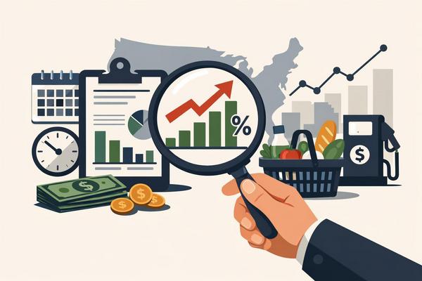
The CPI report is the inflation number most Americans hear about because it tries to show how much everyday prices are changing. If you see a headline saying inflation was 3.4% or 3.1%, that usually means the Consumer Price Index, or CPI, rose that much compared with a year ago.
That number gets treated like a national mood check. Stocks move on it, bond yields jump on it, and people start arguing online about whether inflation is “really” going away.
CPI is supposed to capture the cost of a big basket of things people buy — housing, food, gas, medical care, clothing, and transportation. It’s not a perfect measure of your life or your monthly budget, but it’s the most-watched inflation number in America because it gives one headline figure the whole country can react to.
What the Headline CPI Number Actually Means
The headline figure tells you how much consumer prices changed across the whole basket, including food and energy. That means it covers categories that can move around a lot from month to month.
Gasoline is the classic example. If oil prices jump, headline CPI can look hotter fast. If gas prices fall, the report can suddenly look cooler — even if rent is still grinding higher.
When you read the report, you’ll usually see two main ways prices are measured:
- Month over month: how prices changed from the previous month
- Year over year: how prices changed from the same month one year earlier
Year-over-year gets the big headline because it’s easier to understand. If CPI rose 3.2% year over year, that means prices are 3.2% higher than they were a year ago. Month-over-month matters too, though, because it shows what’s happening right now. A yearly number can look calm even while recent monthly readings start heating up again — or the opposite. If you only read the annual headline and ignore the monthly trend, you’re missing half the story.
Core CPI: The Quieter Number That Often Matters More
Core CPI strips out food and energy so economists can see the underlying inflation trend more clearly. That doesn’t mean food and gas don’t matter — they matter a lot to your wallet. It just means those prices can swing hard for reasons that don’t tell you much about broader inflation pressure.
Say gas drops because oil markets calm down for a few weeks. That could make headline inflation look better. Meanwhile, rent, insurance, restaurant prices, and medical services might still be climbing. That’s why markets and the Fed pay close attention to core CPI — they’re trying to figure out whether inflation is cooling across the economy, not just getting lucky because energy pulled back.
The easiest way to think about it:
- Headline CPI shows the full picture people actually feel
- Core CPI helps reveal the trend underneath the noise
When headline and core are moving in the same direction, the message is usually a lot clearer.
Why Your Experience Might Not Match the Report
CPI measures an average, and averages can feel completely disconnected from real life. If you’re a renter in a city where housing costs are still ripping higher, inflation may feel worse to you than the national report suggests. If you drive a lot for work, gas prices hit your budget harder than they do for someone working from home. If your biggest monthly pain is car insurance or child care, you probably don’t care much that used appliance prices cooled off a little.
The CPI basket is built from broad spending patterns. It reflects the average consumer, not your exact set of bills. That doesn’t make it useless — it just means you should treat it like a national dashboard, not a personal receipt.
Housing is especially important here because shelter carries a huge weight in CPI. That includes rents and something called owners’ equivalent rent, which estimates what homeowners would pay to rent a similar home. That part of the report moves slowly and can keep inflation looking sticky even after other prices cool off. If shelter stays high, CPI usually won’t fall quickly — even when a few other categories improve.
What Investors Are Actually Looking for When the Report Drops
Investors aren’t just looking at whether CPI went up or down — they’re looking at what inside the report is driving it. One report can come in “better than expected” and still worry people if services inflation stays firm. Another can look hot on the surface because of energy, while the details underneath are actually cooler.
Here are a few pieces people tend to focus on right away:
- The monthly change in headline CPI
- The monthly change in core CPI
- Shelter inflation
- Services inflation, especially outside housing
- Whether the result came in above or below forecasts
That last one matters because markets trade on expectations, not just facts. If economists expected 0.2% and the report comes in at 0.4%, the reaction can be sharp even if the yearly number doesn’t look dramatic to regular people. Higher-than-expected inflation can push up Treasury yields, pressure stocks, and reduce hopes for Fed rate cuts. Cooler-than-expected inflation tends to do the opposite. The report matters because it’s not just about prices today — it shapes what people think the Fed will do next.
How to Read a CPI Release Like a Normal Person
You don’t need to be an economist to get the basic message out of a CPI report. A simple way to read it is to move in this order:
- Start with year-over-year headline CPI to see the big number everyone’s talking about
- Check month-over-month headline CPI to see whether prices accelerated or slowed recently
- Look at core CPI, especially the monthly number, for the underlying trend
- Scan shelter, food, and energy to see what’s doing the heavy lifting
- Notice whether inflation is broad-based or concentrated in just a few categories
If headline inflation fell but core stayed firm, the report may not be as encouraging as the headline suggests. If both headline and core cooled, that’s usually a cleaner sign that inflation pressures are easing. And if shelter remains stubbornly high, expect inflation to look sticky even if goods prices behave better.
One common mistake worth avoiding: don’t read one CPI report like it settles everything. Inflation trends show up over time. One month can be noisy. Three or four months pointing the same direction mean a lot more. The smartest way to read CPI is to look for trend, not drama.
What This Means for Your Actual Money
Understanding CPI helps you make sense of the economy, but it shouldn’t push you into knee-jerk financial moves. If inflation is running hot, it can affect borrowing costs, savings rates, wage negotiations, and how far your paycheck stretches. It also shapes what the Fed does with interest rates, which eventually filters into mortgages, credit cards, car loans, and high-yield savings accounts.
For everyday life, the useful questions are pretty practical: Are your biggest expenses still rising faster than your income? Is inflation cooling broadly, or just in categories you don’t spend much on? Could rates stay higher longer because inflation isn’t easing fast enough? Those questions matter a lot more than arguing over a decimal point on social media.
The headline CPI figure gives you one simple signal about where prices are heading — even if the real story is always in the details underneath.
If this made sense, the next thing worth understanding is how the Fed’s rate decisions ripple into your savings account and what you’re actually earning on your money right now.